Security Note
What you can see and do in this application depends on the security permissions associated with your 25Live user account.
- Object Security permissions to the location you want to view
- Advanced Options: 10.0 Edit Locations
- Advanced Options: 10.1 Delete Locations
- Advanced Options: 11.0 Create and Copy Locations
If you can't access something you think you should be able to, contact your 25Live Administrator.
Each location in 25Live has a details page with its layouts, images, headcount capacities, calendars, associated reports, audit trail, and more.
The top section shows the location short name and formal name.
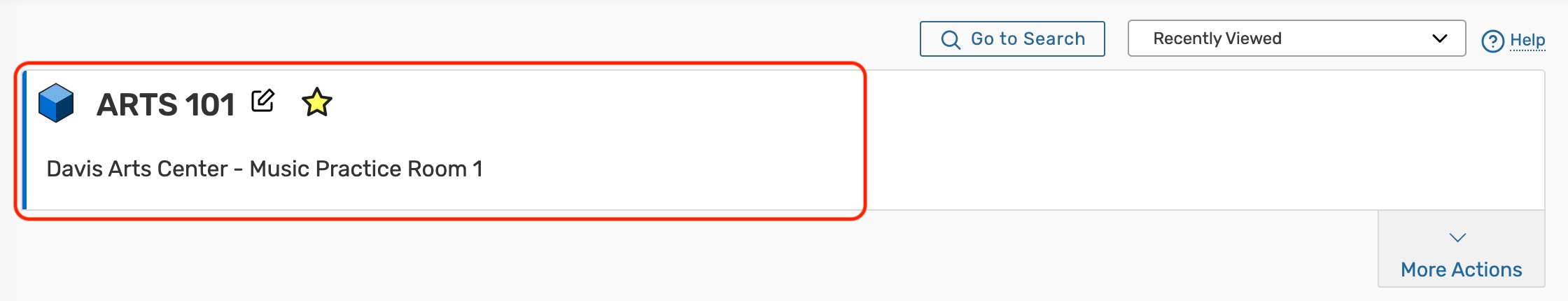 Image: The location short and formal name are at the top of the location details.
Use the star icon ( ) next to the location name to add it to your favorites.
Location Tabs
Below are descriptions of each of the location details tabs and their uses. Please note that what you are able to view on this page will depend on your security settings and configurations. If there are settings you think you should be able to see or edit, please contact your 25Live Administrator.
 Image: On mobile devices, location tabs can be accessed from the dropdown menu below More Actions. Image: On mobile devices, location tabs can be accessed from the dropdown menu below More Actions. |
 Image: The tabs you see in 25Live will depend on your security group's rights. Image: The tabs you see in 25Live will depend on your security group's rights. |
Details
The Details page shows all of a location's data including its layout options, features, notification policy, open hours, relationships with other location(s), and more.
 Image: The Details tab includes several collapsible sections that allow inline editing for users with appropriate permissions.
- Edit Mode - Set the toggle to On to enable inline editing.
- Always Share - Allow unlimited reservations for this location during the same date/time
- Security - This link sends you to the Object Security configuration page for this location in Group Administration.
- Refresh - You can refresh the summary using the refresh icon
 in the upper-right of the summary area.
 - Help - Press to be moved to the KnowledgeBase.
 in the upper-right of the summary area.
The location information is available in collapsible sections:
- Comments - Administrative comments about the room
- Default Instructions - Generally includes room policies or other room instructions
- Features - Attributes representing room features, such as air conditioning, ADA accessibility, or built in AV equipment
- Attributes - Custom location data fields, such as the HVAC zone, the building latitude and longitude, or a room contact
- Hours - The hours and days of the week that the room is open/closed
- Layouts - Shows all layouts defined for this location, each layout's maximum capacity, and the default layout
- Categories - Custom descriptors assigned to a space for purposes of grouping, retrieving, and reporting
- Related Spaces - Location inter-dependencies, such as which locations should always be assigned together, which locations are subdivisions of other locations, which locations are close to other locations, and so on.
- Location Scheduler - Lists the default Location Scheduler for automatically routing newly requested eventsWith permissions, you can hover to view contact details
- Partition - A location grouping, usually established by area of campus, buildings, floors of buildings, or space type (for example, large lecture halls)
- Fill Ratio Percentage - The percentage of seats that should be filled by any event occupying a location
- Express - The Event Type and Event Duration configurations required for setting up an Express Scheduling location
- Building - The building where the location is housed
- Location Satisfaction - Ratings pulled from Eval25 that indicate how students feel about the building on a scale of 1-5
- Layout Details - Displays layout images, layout diagrams, and the default instructions for the selected layout
- Map - Links to Google Maps using the longitude and latitude of the location, as defined in the Attributes
- Notification Policy - Lists the policies that determine the approval type, the length of time that approval is required within, who should be notified when a space is requested or booked
For information on individual fields, see Location Data Overview.
List
This view populates a list of events that fall within a specific date range in the location you are viewing.
For more information, see Working With List Views in 25Live.
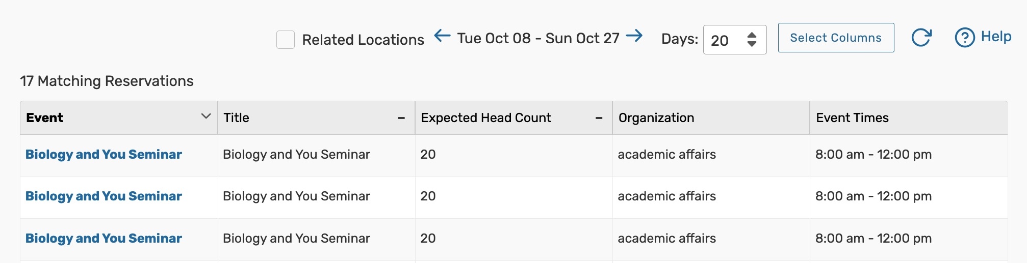 Image: The List tab shows all of the events that take place in this location, laid out in a table with their event details.
Availability (Daily)
With a list of dates in the left-hand column and hours in the top bar, this view shows all events that fall within a specific date range and have the location that you are viewing attached.
For more information, see Working With Availability Views in 25Live.
 Image: The Availability (Daily) view shows a data and time grid of events that take place in this location.
 Availability (Weekly)
This view shows a Sunday through Saturday (or customized) grid of events that take place in the location you're viewing. The top bar has days of the week and specific dates in the top bar and hours in the left-hand column. This view is interactive, allowing you to create events right from the grid.
For more information, see Working With Availability Views in 25Live.
 Image: The Availability (Weekly) tab shows a date and time grid of events that take place in this location over one or more weeks.
Calendar
The Calendar tab displays a calendar of events that have reserved or requested the location you are viewing.
For more information, see Working With Calendar Views in 25Live.
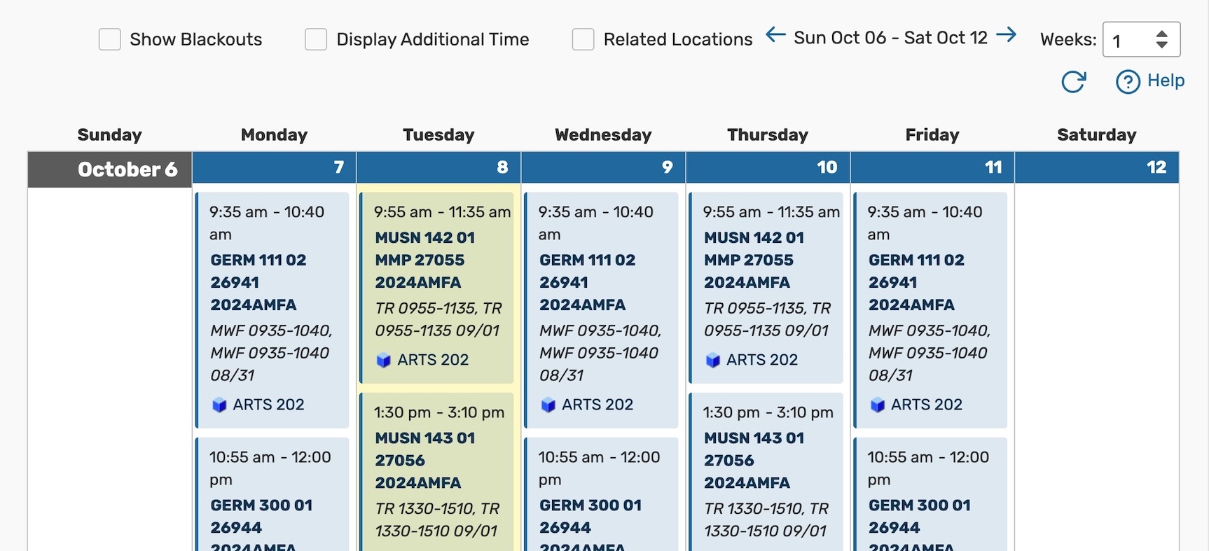 Image: The Calendar tab shows each of the event that take place in this location by week.
Audit Trail
The Audit Trail tab displays a sortable table of changes to this location. Tap or click the Date, User, or Action column headings to sort by those columns.
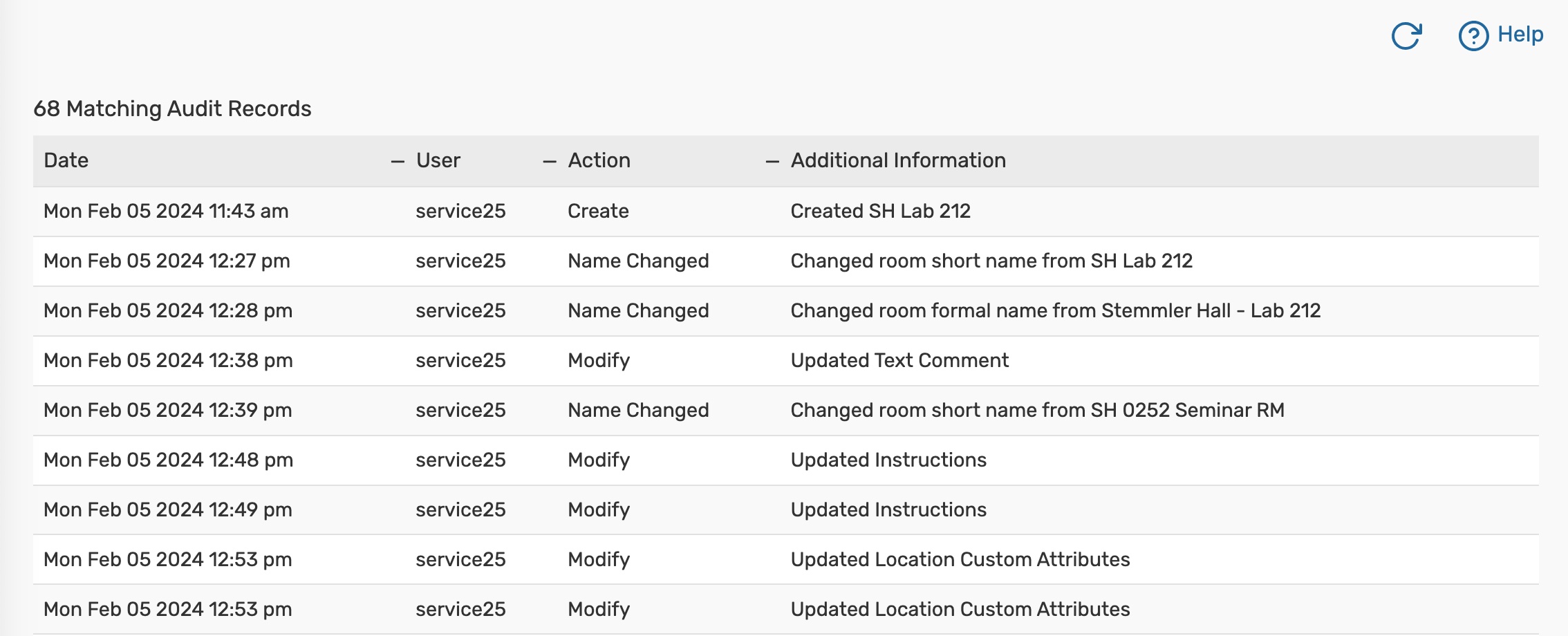 Image: Use the audit trail to see a record of changes made to this location.
More Actions Menu Options
Expand the More Actions menu to see additional actions available for the location you're viewing.
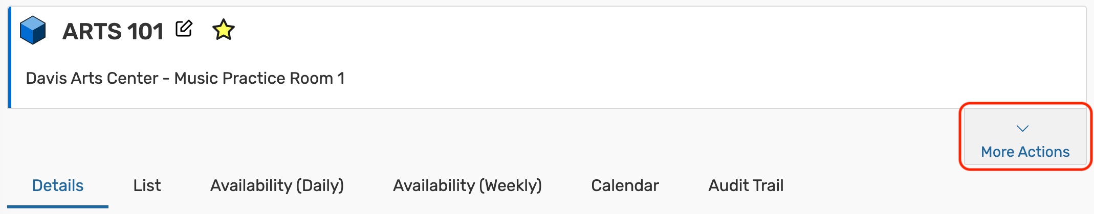 Image: Tap More Actions to open additional location options.
You can close the display using the Collapse link.
 Note that in mobile views, the action labels (Copy Location, Print Report, etc.) are not visible, only the action icons.
Copy Location
Duplicate this location.
For more information, see Copying a 25Live Location.
 Image: Use the Copy Location button to begin duplicating a location.
Print Report
Generate a report or for this location.
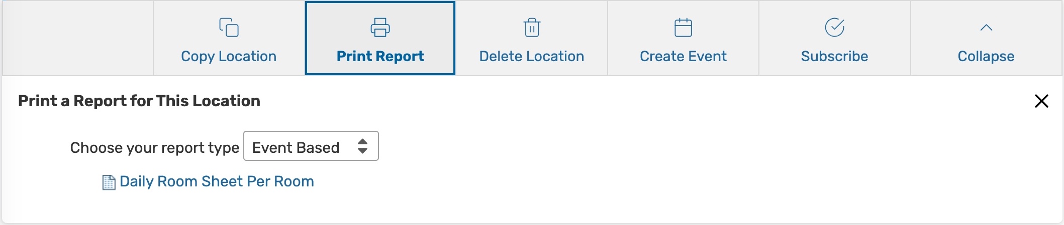 Image: Tap Print Report to open the associated reports.
Delete Location
Permanently delete a location by toggling Delete Mode to On and confirming. Warning: This action cannot be undone.
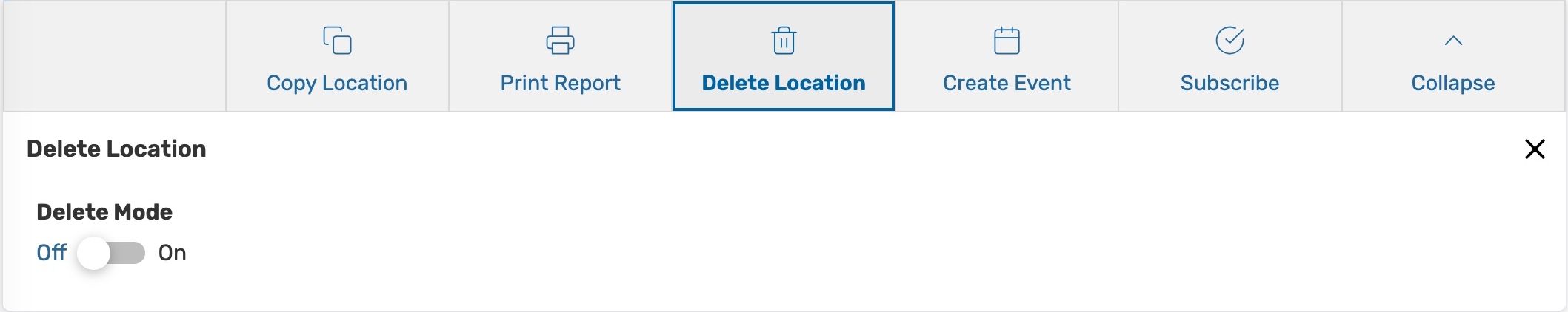 Image: Toggle Delete Mode to On to permanently delete a location from 25Live.
Create Event
Opens a new event form with the location you are viewing already selected. If this location is an Express Scheduling location, the Express Scheduling for will be opened instead of a standard event form.
For more information, see, Creating Events With the Event Form.
Subscribe
Subscribe to an event calendar feed for this location.
For more information, see Subscribing to an Event Feed.
 Image: Subscribe to an event feed.