Availability grids in 25Live are a great way to find a time slot for your event. In many of these views, you can create new events and edit existing ones right from the grid.
In 25Live there are three main ways to access an availability view (or grid) in 25Live: through the More menu, an event, location, or resource search, or the page of a specific event, location, or resource.
These views function in nearly identical ways, with a few small differences.
Availability View Types
Default Availability
You can get to the default Availability view by selecting Availability from the More menu in the top navigation bar.
Default Availability views are populated based on saved searches. If no search is selected, this view will use your starred location search.
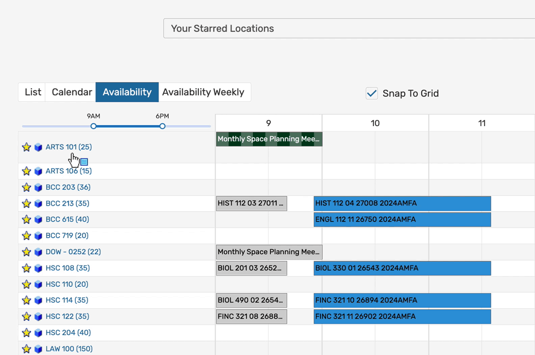
- Availability: Organized by locations and event hours, this view uses location searches to populate a daily availability view. This view is interactive, allowing you to create and reschedule events right from the grid.
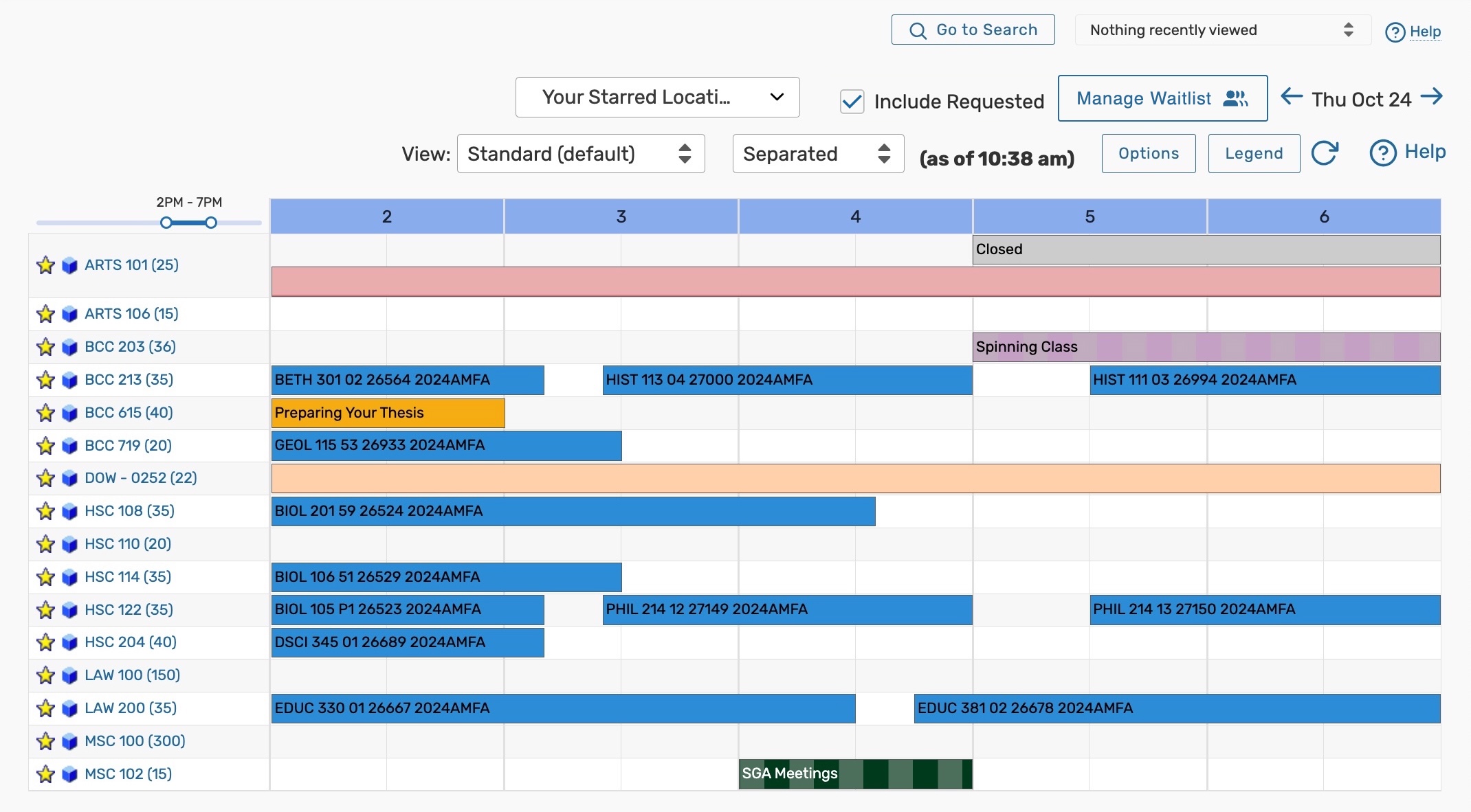 Image: In this example, the Availability view shows all of the events that take place in a starred location, between 2pm and 7pm on October 24th.

Object Availability
Click or tap any 25Live location, resource, organization, or contact to go to its Details page. Then select the Schedule, Availability (Daily), or Availability (Weekly) tab.
- Availability (Daily): Organized by occurrence dates and hours, this view shows all events that fall within a specific date range and have a specific location or resource attached on a daily availability grid.
 Image: In this example, the Availability view shows all of the locations that take place in location HSC 122 on October 24th, between 9am and 4pm.
- Schedule: Organized by occurrence dates and hours, this variation of the Availability (Daily) view shows all of the occurrences and segments for the event you are viewing. This view is interactive, allowing you to reschedule right from the grid.
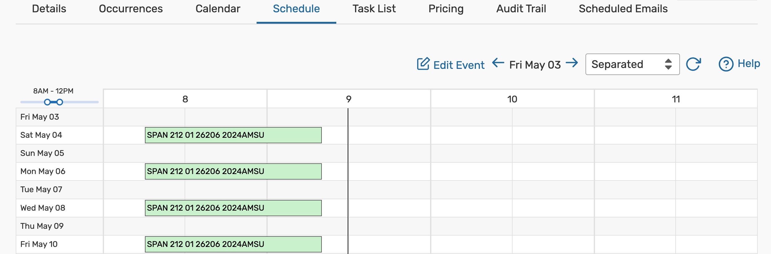 Image: In this example, the Schedule view shows all of the occurrences of event "SPAN 212 01 26206 2024AMSU," that begin on or after May 3rd, and take place between 8am and 12pm.
Show Waitlist - When reservations are waiting for the current event or blocking it, this button will be available to view waitlists
- Availability (Weekly): This view is unique to locations and displays a Sunday through Saturday (or customized) grid of events for a specific location. This view shows several weeks at once, organized by days of the week and occurrence hours. This view is interactive, allowing you to create events right from the grid.
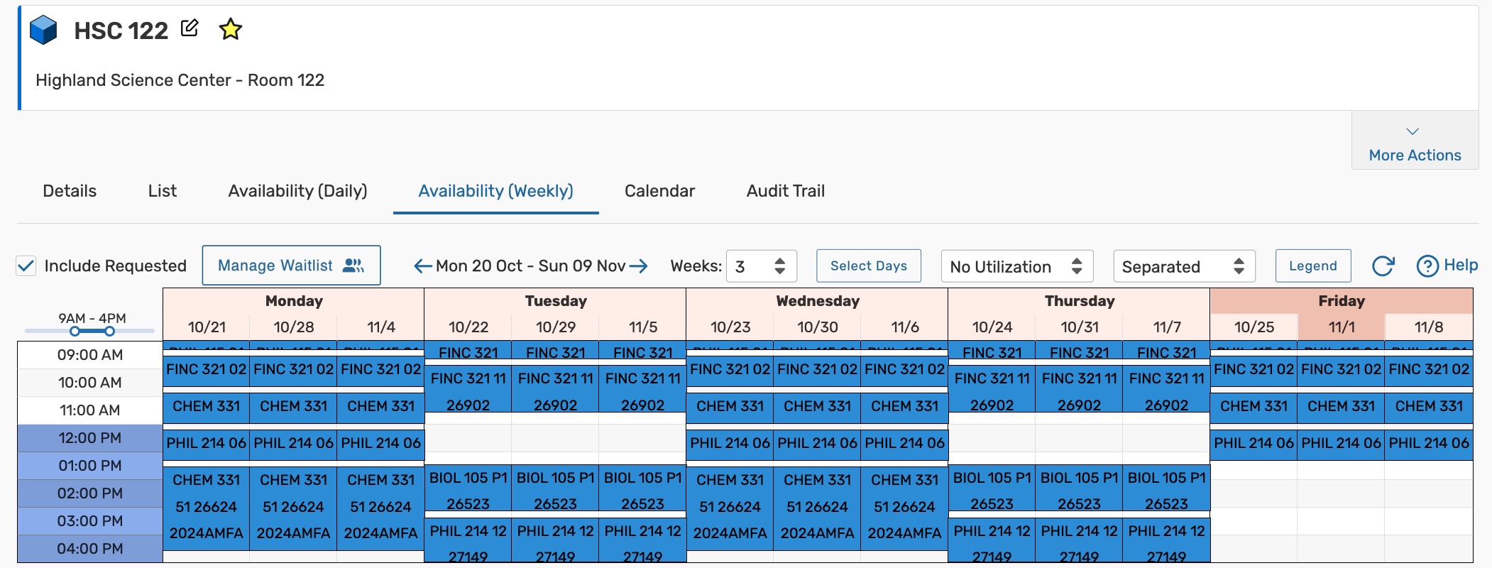 Image: In this example, the Availability view shows all of the events that take place on a weekday in room HSC 122, between October 20th and November 9th, between 9am and 4pm.


Search Availability
Search Availability views display events generated from searches run on the Search page, within a selected date range. Unlike the default views, the search does not need to be saved to use this view.
- Availability: Organized by objects and occurrence hours, this view uses event, location, and resource searches to populate a daily availability view. This view is interactive, allowing you to create and reschedule events right from the grid.
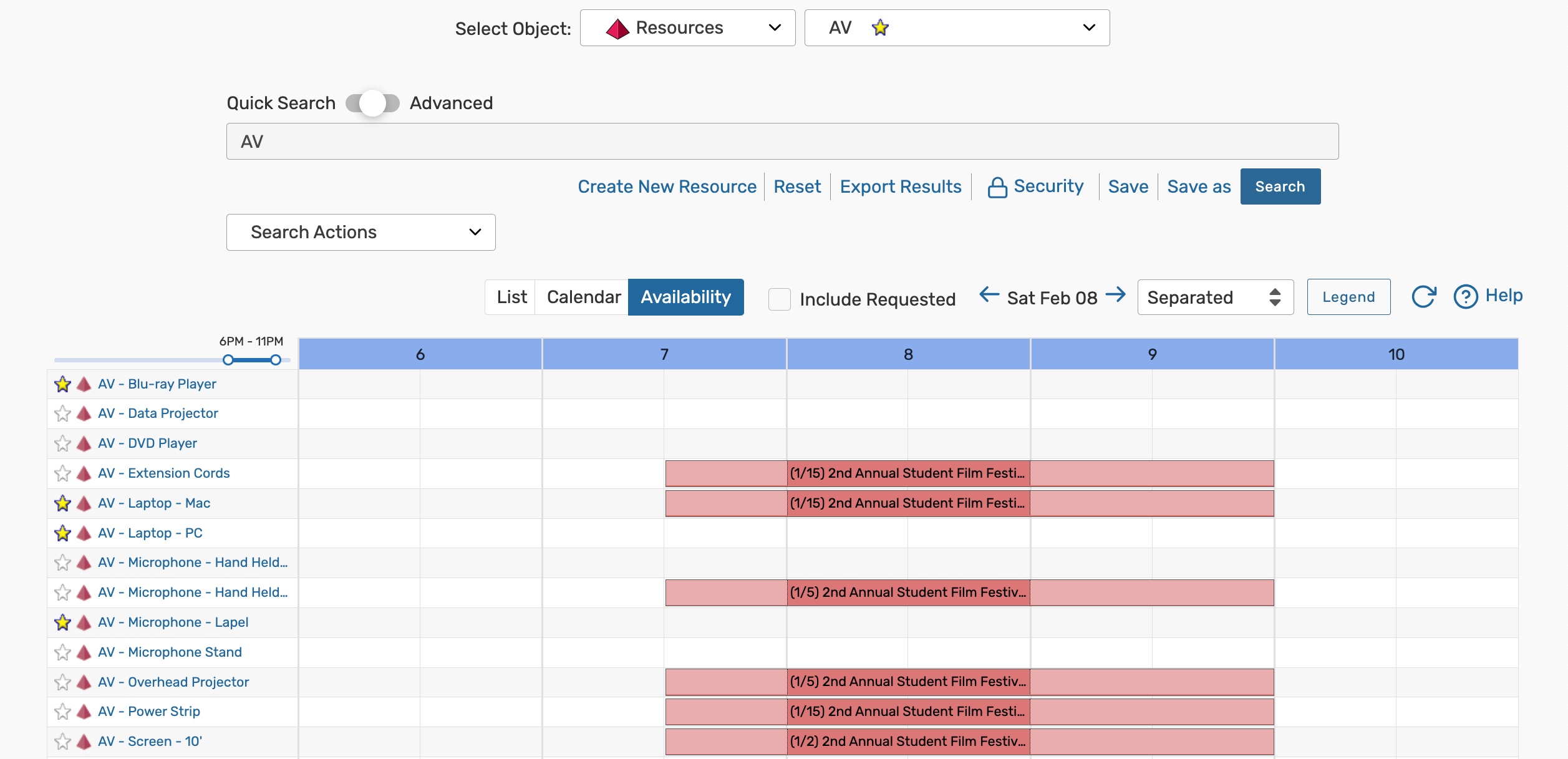 Image: In this example, the Availability view shows all of the resource reservations that take place on February 8th between 6pm and 11pm, and that were returned after running a resource search named "AV".
- Availability (Weekly): This view is unique to location searches and shows a Sunday through Saturday (or customized) grid of events that take place in a group of locations. This view is interactive, allowing you to create events right from the grid.
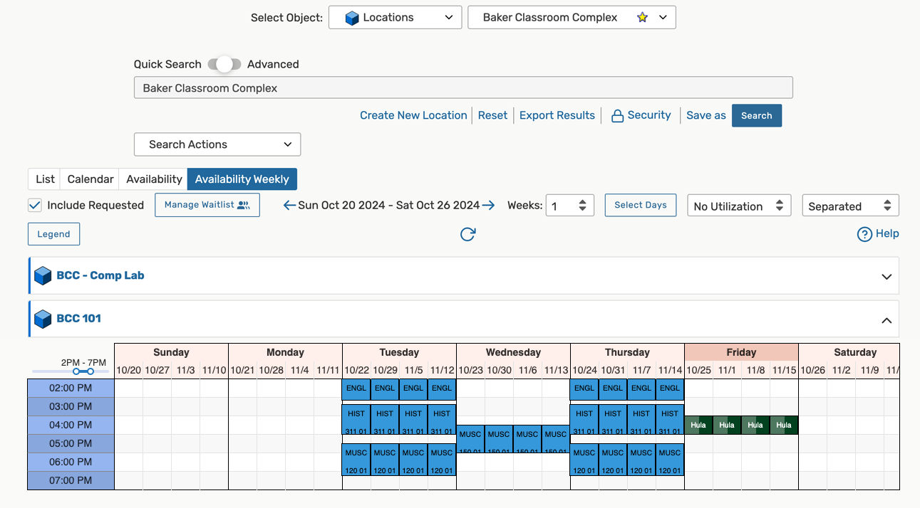 Image: In this example, the Availability view shows all of the events that were returned after running a location search name "Baker Classroom Complex," that take place on a weekday between October 20th and November 16th, between the hours of 9am and 6pm,


Understanding the Availability Daily Grid
 Image: Availability views can be accessed on-the-go from a mobile device. |
Each Availability view is specific to one or more events, locations, or resources and shows their event schedules. The views consist of...
 The Schedule view is a type of Availability (Daily) grid that is specific to events. You cannot create additional occurrences from the grid, but you can reschedule them. |
 ) icon in the grid squares.
 )
)Understanding the Availability Weekly Grid
The weekly availability grid is unique to locations. This view displays the days of the week and dates at the top, with times on the left-hand side. A toolbar at the top provides several controls to adjust the grid display. (More information on these in the "Using the Availability Controls" section.)
Here you can compare location reservations on specific days from week to week. If multiple locations are displayed, each will have its own grid with the days and weeks selected.
Events can be created from the weekly grid, but unlike the availability daily views, they cannot be rescheduled there.
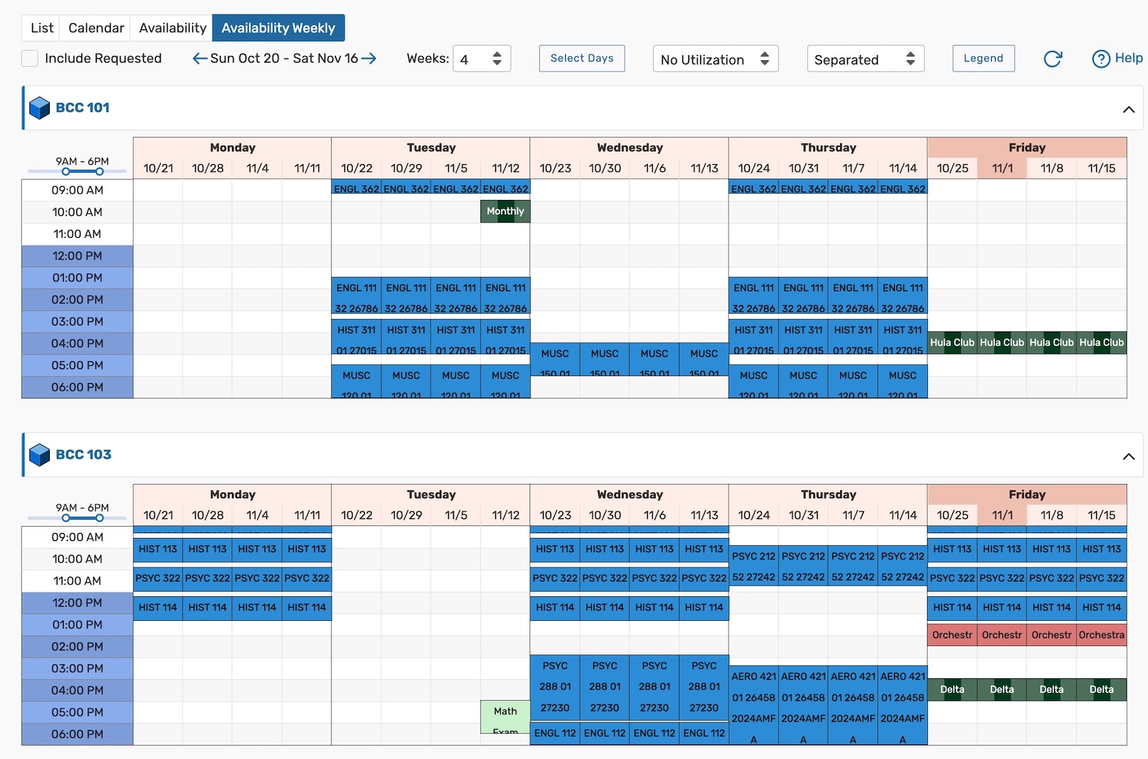 Image: In this example, there are two locations displayed. Both locations show the Monday-Friday reservation schedule for a four week span, for events that take place between 9AM and 6PM.
Using the Availability Controls
Please note that some of the buttons, dropdowns, and other controls described below are not available on every availability view. What you see will depend on where you are in the application and whether you are viewing a daily or weekly grid. For more comprehensive explanations of the controls on Search pages, please see our articles on Quick Searching and Advanced Searching.
Updating the Dates Displayed
To move the grid's date(s) forward or backward, use the arrow buttons or tap on the dates to open the calendar picker.
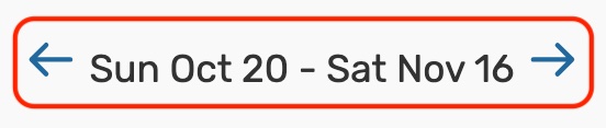 Image: Use the arrows to move the date(s) forward or backwards.
 In the availability weekly views, use the Weeks dropdown to adjust the number of weeks displayed and the Select Days button to adjust the days of the weeks displayed.
 Image: Use the Weeks dropdown to select the number of weeks displayed in an availability weekly view. Image: Use the Weeks dropdown to select the number of weeks displayed in an availability weekly view. |
 Image: Use the Select Days to adjust the days of the weeks displayed in an availability weekly view. Image: Use the Select Days to adjust the days of the weeks displayed in an availability weekly view. |
Updating the Hours Displayed
At the top-left corner of the availability grid are controls for changing which hours are shown. Drag a point on the hours bar to adjust the hours shown in the grid.
 Animation: Use the hours slider to adjust the hours displayed on the availability grid.
Displaying the Location Name and Capacity View Options
An Options button is available on daily location availability views that rely on searches.
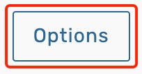 Image: The availability daily location Options.
When clicked or tapped, a modal will open with an option to choose whether you want the default layout capacity appended to the end of the location names. This value will be displayed in parenthesis. Additionally, you can choose whether you want the short or formal location name displayed. Note that this column has limited space, so long names may be cut off.
 Image: Clicking options will let you choose whether how you want the location column to display names and capacities. Image: Clicking options will let you choose whether how you want the location column to display names and capacities. |
 Image: Short location name displayed with the default layout capacity in parenthesis. Image: Short location name displayed with the default layout capacity in parenthesis. |
 Image: Formal location name displayed with no layout capacity. Image: Formal location name displayed with no layout capacity. |
Interacting With Grid Objects
Each event, location, and resource on an availability view is interactive.
- Click or tap on an object link to move to its Details page.
- Hover over an object link to see a summary of its details. (
 )
) - Right-click on an object to see more actions. ()
 Animation: Availability views are interactive. Hover, left-click, and right-click on links to see more information.
Using the Separated, Overlapping, and Edit Modes
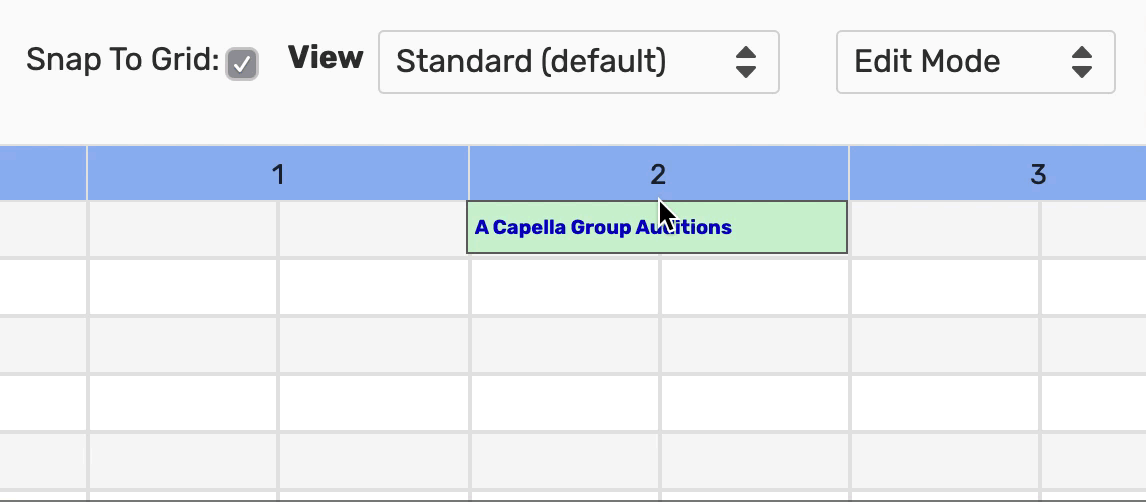
Grids have Separated & Overlapping view modes that adjust event block placement. Some views also include Edit Mode.
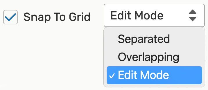 Image: Edit Mode dropdown options.
Separated
All events with overlapping times will be displayed above one another for easier viewing.
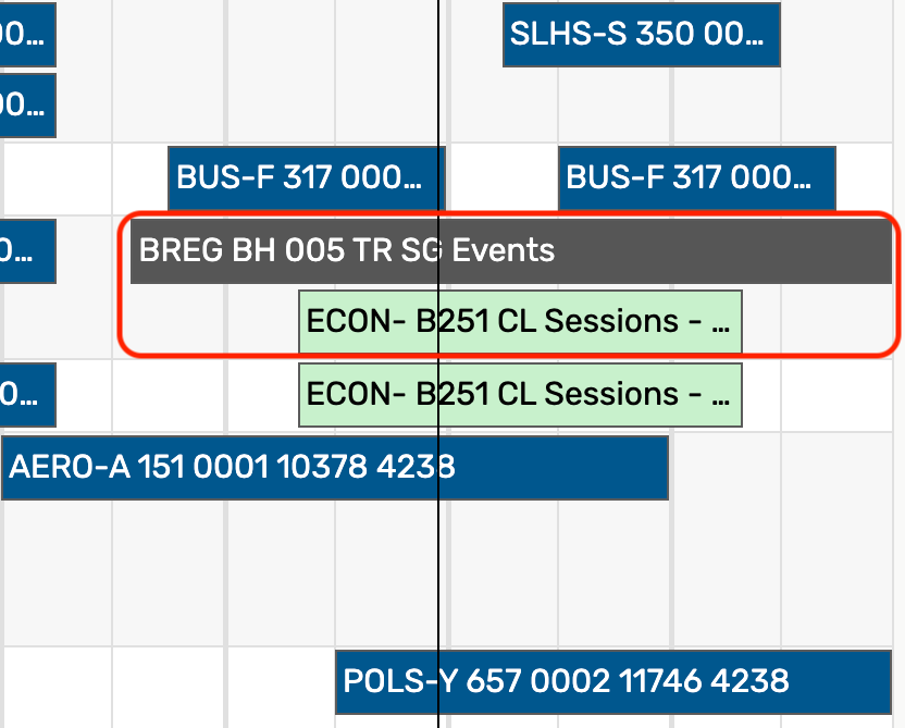 Image: Events that occur at the same time will be displayed above one another in Separated mode.
Overlapping
All events with overlapping times will be displayed in overlapping time-blocks to highlight the overlap.
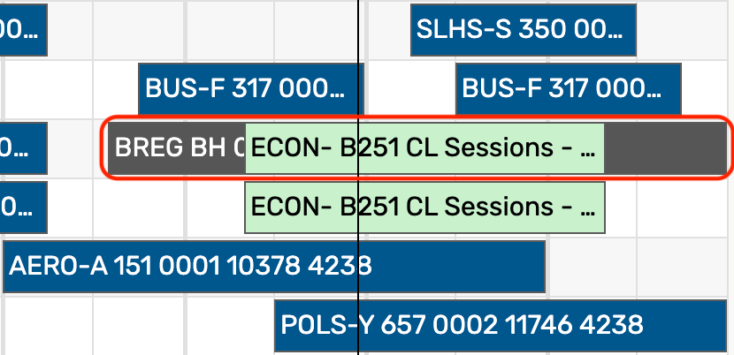 Image: Events that occur at the same time will be displayed on top of one another in Overlapping mode.
Edit Mode
Allows you to change the event date and time by dragging the event's colored block within any available grid squares.
 Animation: Drag an event block to a new time using Edit Mode.
Select the Snap To Grid checkbox above the grid to restrict times to half-hour blocks, or uncheck the checkbox to freely move the event to any time.
Creating Events From the Grid
Availability views allow you to create events using the paper and pencil icon  directly from the grid. If a location is setup for Express Scheduling, clicking the icon will open the Express Scheduling form for quick event creation. Use the Open in Form button to create an event in the standard Event Form instead.
Understanding the Event Block Colors
The rectangular event blocks in the availability grid are color-coded to signal closed hours, blackout hours, and the different statuses and characteristics of events.
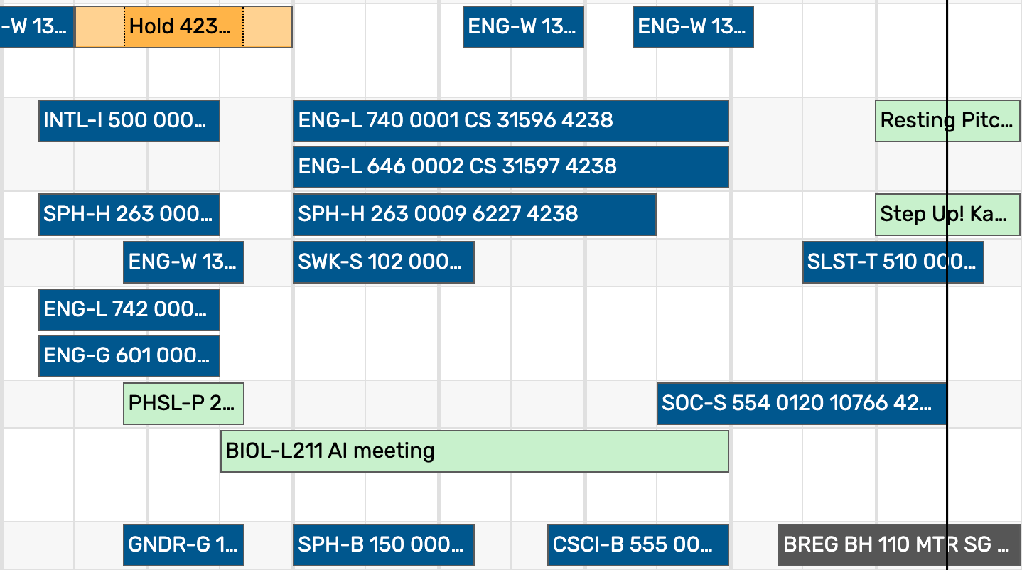 Image: In this example, the colors on event "Hold 423" indicate that it is a related event and has pre-event and post-event times.
Click or tap the Legend button to reveal the Availability Color Legend and see which colors/patterns are associated with your grid's event blocks.  Image: Tap the Legend button to view the Availability Color Legend. Image: Tap the Legend button to view the Availability Color Legend.The first several colors/patterns in the legend are standard:
Setup, pre-event, post-event, and takedown times will display in a lighter shade of the block color. (See the "Hold 423" reservation in the image above.) For more information on adding custom colors/patterns, please see Adding Grid Coloring to Availability Views. |
 Image: The top seven colors in the legend are system colors. Colors added to your instance will be displayed under the standard colors. |
Changing to Location Utilization View
The View dropdown on location availability daily and weekly views allows you to choose between four modes that change the colors of your event blocks.
 Image: View dropdown.
Security Note
To access the utilization views, your security group will need the following permission in Series25 Group Administration:
Academic Options: 2.0 View Utilization Statistics on Availability Grids = Yes
Standard (default) View
In the Standard view mode, the squares representing blocks of time in the availability grid are color-coded to signal different statuses of events (as shown above under "Understanding the Event Block Colors"). This view's custom colors are set in the Grid Coloring System Settings.
Utilization Views
In the three utilization views (Utilization (RHC/CAP), Utilization (EHC/CAP), Utilization (RHC/EHC)) the squares representing blocks of time in the availability grid are color-coded to represent the percentage of the location’s utilization for that block of time.
Utilization view modes:
- Utilization (RHC/EHC): Registered Head Count/Expected Head Count: Shows enrollment utilization.
- For example, this view shows which sections can still register more students or are potentially over the enrolled (e.g. 38 students registered, with a max enrollment of 40)
- Utilization (EHC/CAP): Expected Head Count/Maximum Capacity: Shows sections that might have room to grow in their current location.
- For example, a section in which 40 students could register but the room holds 45. Or, conversely, a section that potentially could reach full enrollment but does not have enough seats in the current location.
- Utilization (RHC/CAP): Registered Head Count/Maximum Capacity: Shows true seat utilization.
- For example, this view shows the number of registered students vs. the number of available seats in the location.
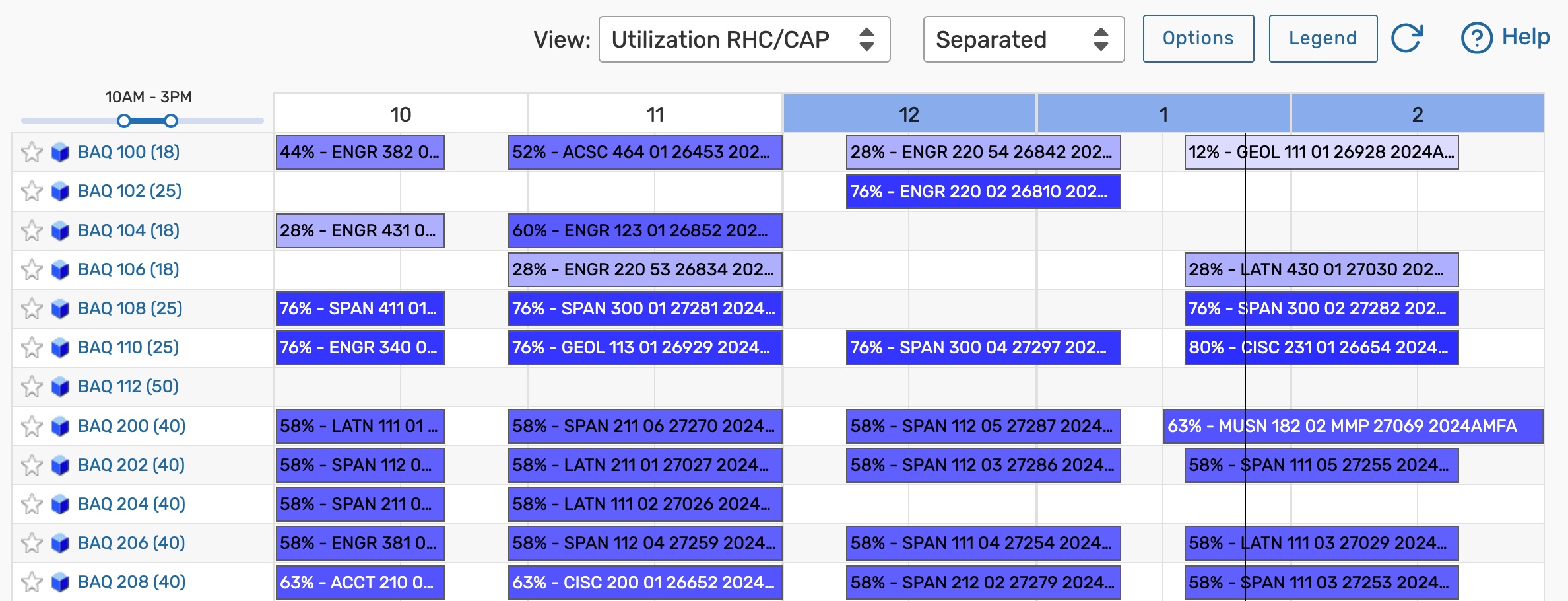 Image: Example of the Utilization RHC/CAP view.
Utilization color meanings:
- Gradient Spectrum (white to blue): White indicates the location is 0% utilized for that hour, with colors darkening along a spectrum to blue indicating 100% utilization
- Grey: Location utilization is complicated by one of the following:
- The location max capacity is equal to zero
- The location is a subdivision of, divides into, or blocked by a relationship with another location
- The location assignment is shared for that hour
- Red: Location utilization is greater than 100% for that hour
Note: Expected Head Count in Campus Solutions
Expected headcount is typically defined as the maximum number of students that can enroll in a section. However, if your institution uses the Campus Solutions SIS, your setup may be configured to import the section's Requested Room Capacity instead of the maximum enrollment.
These utilization view modes are most useful when viewed in conjunction with the use of the Series25 LYNX Interface because LYNX exchanges up-to-the-minute registered headcount information between the Series25 database and your SIS (Student Information System). In addition, registered headcount and expected headcount values for combined/cross-listed sections are standardized in LYNX. If you are not already using LYNX, please contact your Series25 Account Manager to learn more.
Including Requested Events
Select the Include Requested checkbox to display requested events on the grid.
 Image: Include Requested Checkbox.
Managing Waitlist Requests
When searching for locations you may encounter the need to manage a waitlist of events requesting that location. For more information, see our Help Center article, Managing Waitlist Requests. A "Show Waitlist" button will also appear when reservations are waiting for the current event or blocking it.
Refreshing the Grid
If any changes have been made that affect the availability grid criteria, press the refresh icon to update the results.
 Image: Press the refresh button if recent changes are missing from the grid.
If the availability view that you are using has the time listed in parentheses, the refresh time will be reflected there.
 Image: The time displayed will reflect the last time the grid was refreshed.,
Scrolling to the Top
When navigating availability grids, use the arrow button ( ) in the bottom-right corner to quickly scroll to the top.