Lists, calendars, and availability grids are the three main ways to view sets of data in your 25Live instance. These views are available through the 25Live More menu, Search pages, and individual object pages.
This article provides an overview of each view, including the types of data that can be used for each and their locations in 25Live. For information on how to use each view, please see the following articles:
- Working With List Views in 25Live
- Working With Calendar Views in 25Live
- Working With Availability Views
Default Views
These views are access through the More menu and are populated by saved searches. If no search is selected, they will use a starred object search.
- List: This view uses a search to populate a table of events that take place within the date range that the user has selected. You might use this view to see an overview of all the events that have reserved a group of resources (such as AV equipment) today.
- Calendar: This view uses a search to populate a calendar of events that take place within the date range that the user has selected. You might use this view if you want an overview of all the events taking place this week in a group of locations.
- Availability: With a list of locations in the left-hand column, this view uses location searches to populate a daily availability grid. This view is interactive, allowing you to create and reschedule events right from the grid. You might use this view to check for availability in a group of locations before scheduling an event.
How to Access the Default Views
- Use the More menu in the top navigation bar to get to the default List, Calendar, and Availability views. Depending on your System Settings, the Calendar or Availability view may also be some users' Home page.
 Image: The More menu is located in the top-right, in the navigation bar.
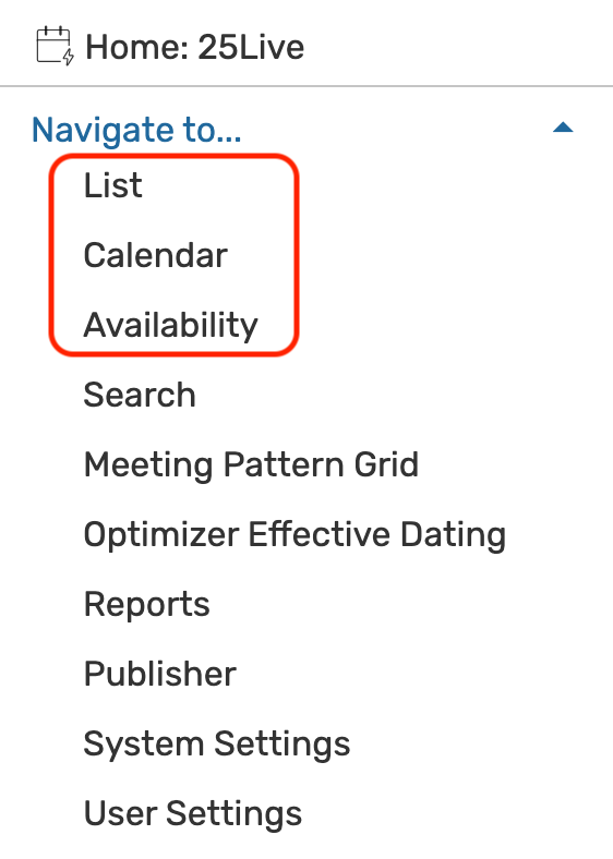 Image: The default List, Calendar, and Availability views are located under Navigate to...
Available Search Types for Each View
| Object Search Type | List | Calendar | Availability |
|---|---|---|---|
| Event Search |  |
 |
|
| Location Search |  |
 |
 |
| Resource Search |  |
 |
|
| Organization Search |  |
 |
Object Views
Click into any 25Live object (location, resource, event, etc.) to see the available views. Possible views include: List, Schedule, Availability (Daily), Availability (Weekly), and Calendar.
- List: This view populates a table of events that fall within a specific date range and have a specific object attached. You might use this view to see an overview of all the events that have reserved one specific resource today.
- Schedule: With a list of dates in the left-hand column, this view shows all of an event's occurrences and segments on a grid, beginning with the day before the first occurrence. This view is interactive, allowing you to reschedule occurrences right from the grid.
- Availability (Daily): With a list of dates in the left-hand column, this view shows all events that fall within a specific date range and have a specific object attached, on a daily availability grid. This view is interactive, allowing you to create and reschedule events right from the grid. You might use this view to check for availability in a specific location before scheduling an event.
- Availability (Weekly): This view shows a Sunday through Saturday (or customized) grid of events that take place in a specific location. This view is interactive, allowing you to create events right from the grid. You might use this view to check for availability in a specific location before scheduling an event.
- Calendar: This view populates a calendar of events that are attached to a specific object and take place within the date range that the user has selected. You might use this view if you want an overview of all the events sponsored by a specific organization.
How to Access the Object Views
- Use any object link in 25Live to click into that object's Details page.
- Use the tabs to access each view.
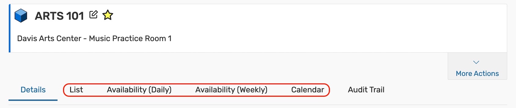 Image: Example of the List, Availability (Daily), Availability (Weekly), and Calendar tabs on an object details page.
Available Views for Each Object Type
| Object Type | List | Schedule | Availability (Daily) | Availability (Weekly) | Calendar |
|---|---|---|---|---|---|
| Events |  |
 | |||
| Locations |  |
 |
 |
 | |
| Resources |  |
 |
 | ||
| Organizations |  |
 | |||
| Contacts |  |
 |
Search Views
Search views can be accessed from the Search page after running any search. Unlike the default views, the search does not need to be saved to use these views. The available views vary for each object and include List, Availability, Availability (weekly), and Calendar. Although it is not specified in the label, the Availability view shows daily availability.
- List: This is the default search result view. Each List view populates a table of objects using the search query.
- Calendar: Each calendar view uses a search to populate a calendar of events that take place within the date range that the user has selected. You might use this view if you want to see all of the events taking place this week that have overdue tasks.
- Availability: With a list of objects in the left-hand column, this view uses event, location, and resource searches to populate a daily availability grid. This view is interactive, allowing you to create and reschedule events right from the grid. You might use this view to check for availability in a group of locations before scheduling an event.
- Availability (Weekly): This view shows a Sunday through Saturday (or customized) grid of events that take place in a group of locations. This view is interactive, allowing you to create events right from the grid. You might use this view to check for availability in a specific location before scheduling an event.
How to Access the Search Views
- Navigate to the Search page through the More menu or the Go to Search button.
- Use the Select Object dropdown to choose a search type.
- Run a new or saved search.
 Image: Example of List, Calendar, Availability, and Availability Weekly views on a location search page.
Available Views for Each Object Type
| Object Type | List | Availability | Availability Weekly | Calendar |
|---|---|---|---|---|
| Event Search |  |
 |
| |
| Location Search | |
|
|
|
| Resource Search | |
|
| |
| Organization Search | |
| ||
| Contact Search | |
|||
| Task Search |  |
 |
Using a List View
Please see Working With List Views in 25Live
Using an Availability Daily or Weekly View
Please see Working With Availability Views
Using a Schedule View
Please see Working With Availability Views
Using a Calendar View
Please see Working With Calendar Views in 25Live