Security Note
What you can see and do in this application depends on the security permissions associated with your 25Live user account.
- Object Security permissions to the resource you want to view
- Advanced Options: 12.0 Edit Resources
- Advanced Options: 12.1 Delete Resources
- Advanced Options: 13.0 Create and Copy Resources
If you can't access something you think you should be able to, contact your 25Live Administrator.
Each resource in 25Live has a details page with its instructions, notification policy, inventory, event calendar, audit trail, and more.
The top section shows the resource name. Use the star icon ( ) next to the resource name to add it to your favorites.
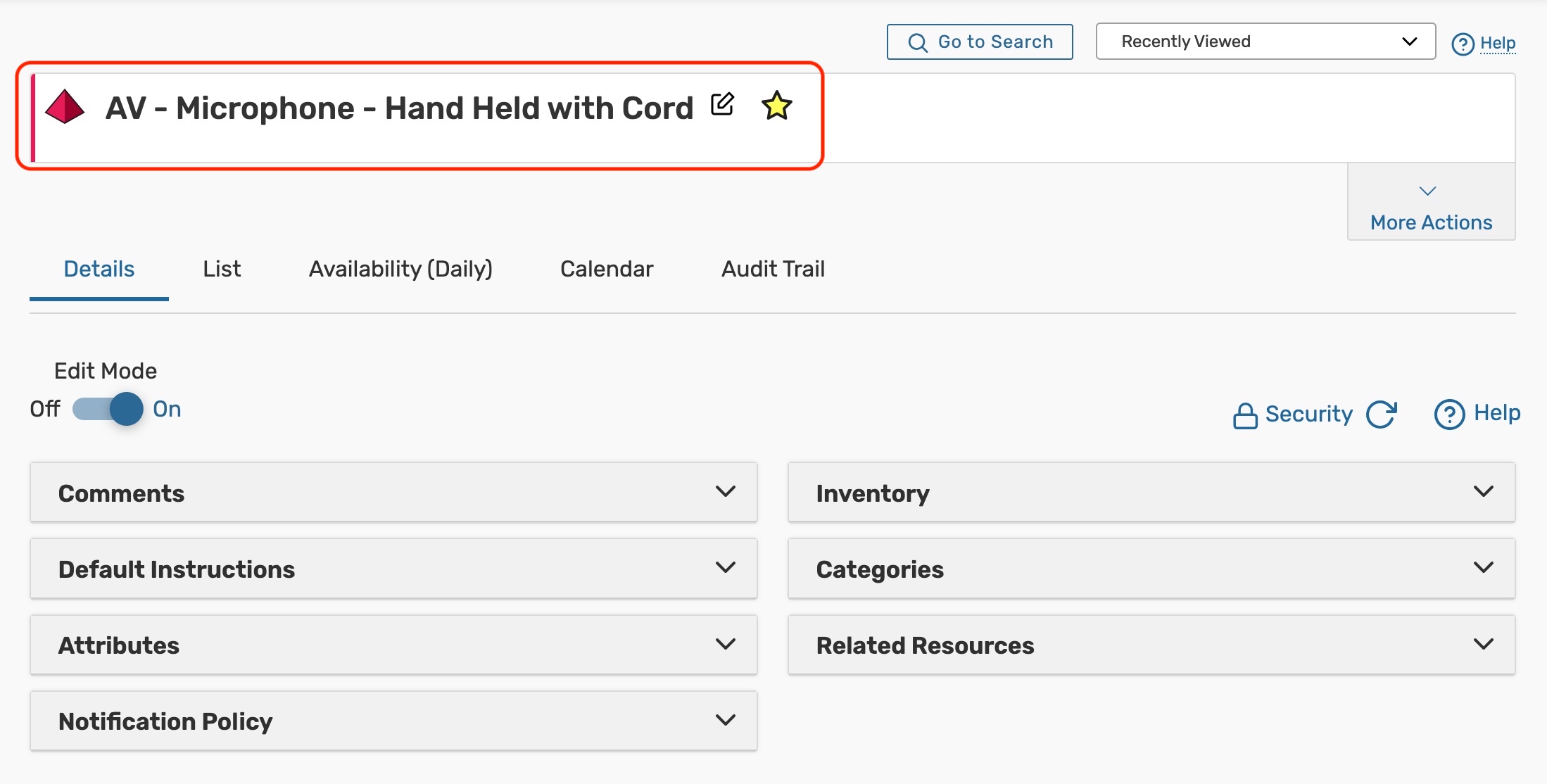 Image: The resource name is at the top of the resource details.
Resource Tabs
Below are descriptions of each of the resource details tabs and their uses. Please note that what you are able to view on this page will depend on your security settings and configurations. If there are settings you think you should be able to see or edit, please contact your 25Live Administrator.
 Image: On mobile devices, the resource tabs can be accessed from the dropdown menu below More Actions. Image: On mobile devices, the resource tabs can be accessed from the dropdown menu below More Actions. |  Image: The tabs you see in 25Live will depend on your security group's rights. Image: The tabs you see in 25Live will depend on your security group's rights. |
Details
The Details page shows all of a resource's data including its instructions, attributes, notification policy, and more.
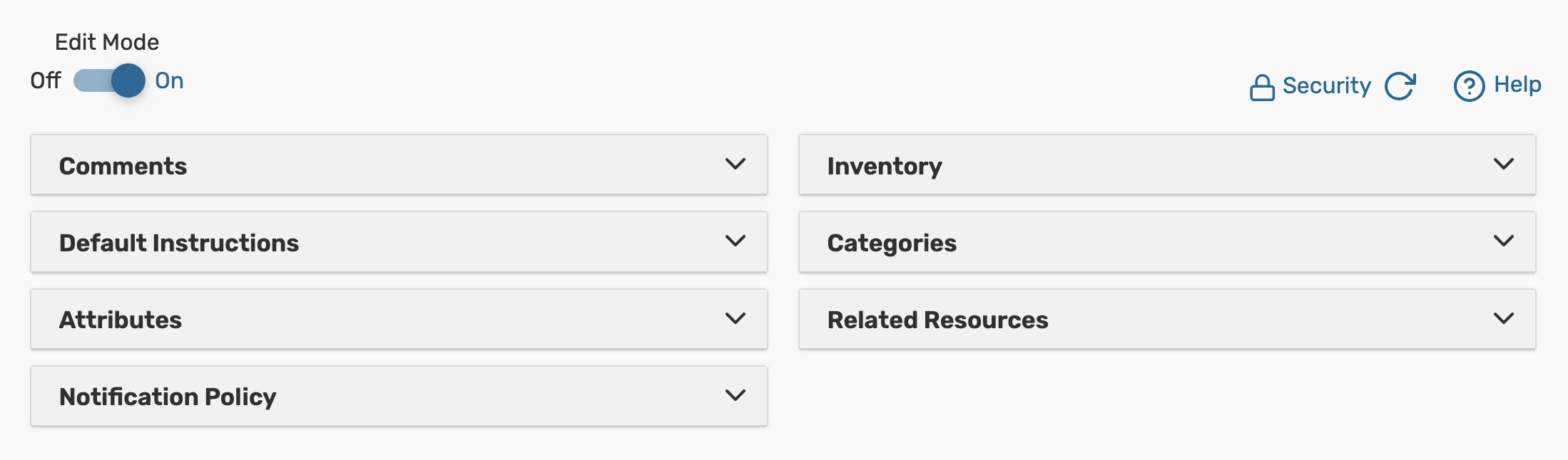 Image: The Details tab includes several collapsible sections that allow inline editing for users with appropriate permissions.
- Edit Mode - Set the toggle to On to enable inline editing.
- Security - This link sends you to the Object Security configuration page for this resource in Group Administration.
- Refresh - You can refresh the summary using the refresh icon
 in the upper-right of the summary area.
 - Help - Press to be moved to the KnowledgeBase.
 in the upper-right of the summary area.
The resource information is available in collapsible sections:
- Comments - Administrative comments about the resource.
- Default Instructions - Generally includes resource rental policies or other instructions.
- Attributes - Custom resource data fields, such as the last time the resource was serviced or an image of the resource.
- Notification Policy - Lists the policies that determine the approval type, the length of time that approval is required within, and who should be notified when the resource is requested or booked.
- Inventory - The stock total for the resource. The most recently updated stock totals will appear at the top of this list.
- Categories - Custom descriptors assigned to a resource for purposes of grouping, retrieving, and reporting.
- Related Resources - Resource inter-dependencies.
- Also Assign – Other resources that are also automatically assigned to an event when this resource is assigned.
- Substitute For - Resources that will get assigned to an event instead of this one. (Such as in cases where a resource temporarily unavailable).
For more information, see Resource Data Overview.
List
This view populates a list of events that fall within a specific date range that have reserved the resource you are viewing.
For more information, see Working With List Views in 25Live.
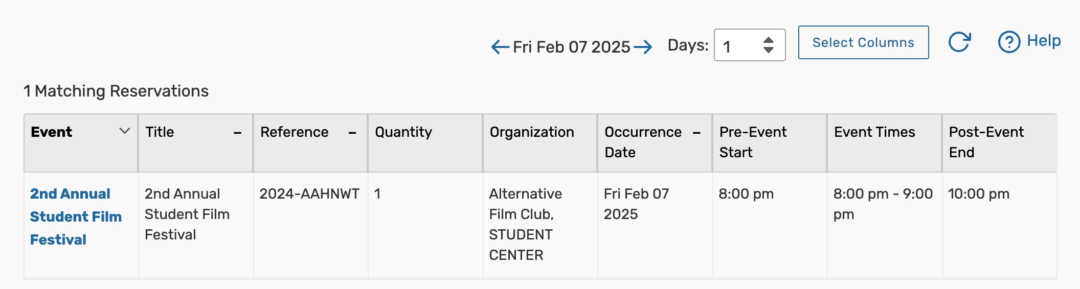 Image: The List tab shows all of the events that take place in this resource, laid out in a table with their event details.
Availability (Daily)
With a list of dates in the left-hand column and hours in the top bar, this view shows all events that fall within a specific date range and have the resource that you are viewing attached.
For more information, see Working With Availability Views in 25Live.
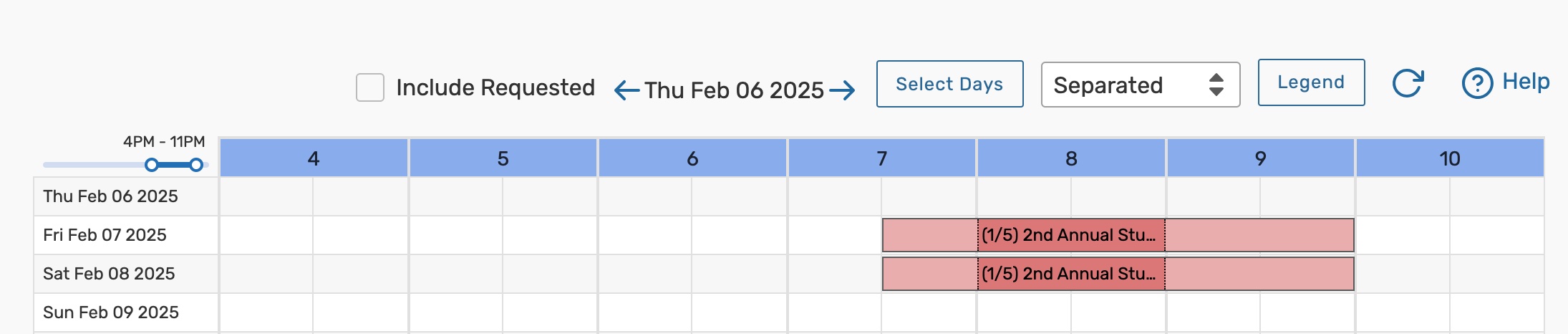 Image: The Availability (Daily) view shows a date and time grid of events that have this resource reserved.
Calendar
The Calendar tab displays a calendar of events that have reserved or requested the resource you are viewing.
For more information, see Working With Calendar Views in 25Live.
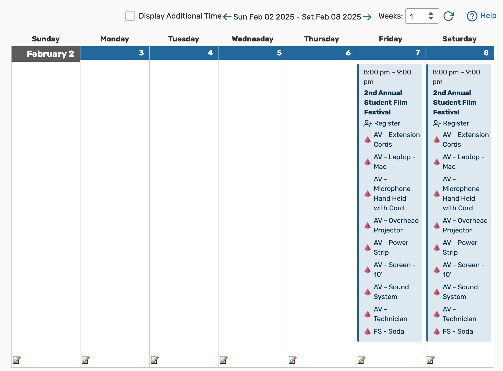 Image: The Calendar tab shows each of the event that take place in this resource by week.
Audit Trail
The Audit Trail tab displays a sortable table of changes to this resource. Tap or click the Date, User, or Action column headings to sort by those columns.
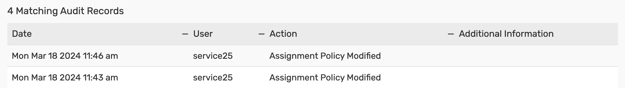 Image: Use the audit trail to see a record of changes made to this resource.
More Actions Menu Options
Expand the More Actions menu to see additional actions available for the resource you're viewing.
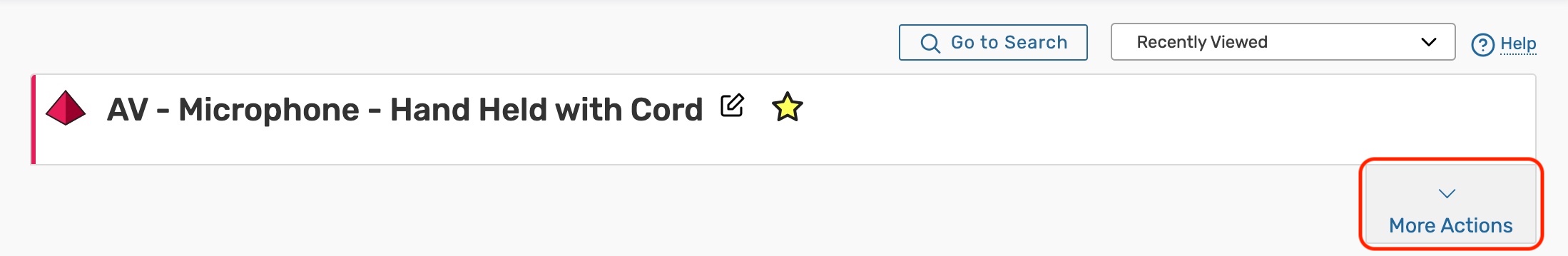 Image: Tap More Actions to open additional resource options.
You can close the display using the Collapse link.
 Note that in mobile views, the action labels (Copy Resource, Delete Resource, etc.) are not visible, only the action icons.
Copy Resource
Duplicate this resource.
For more information, see Copying a 25Live Resource.
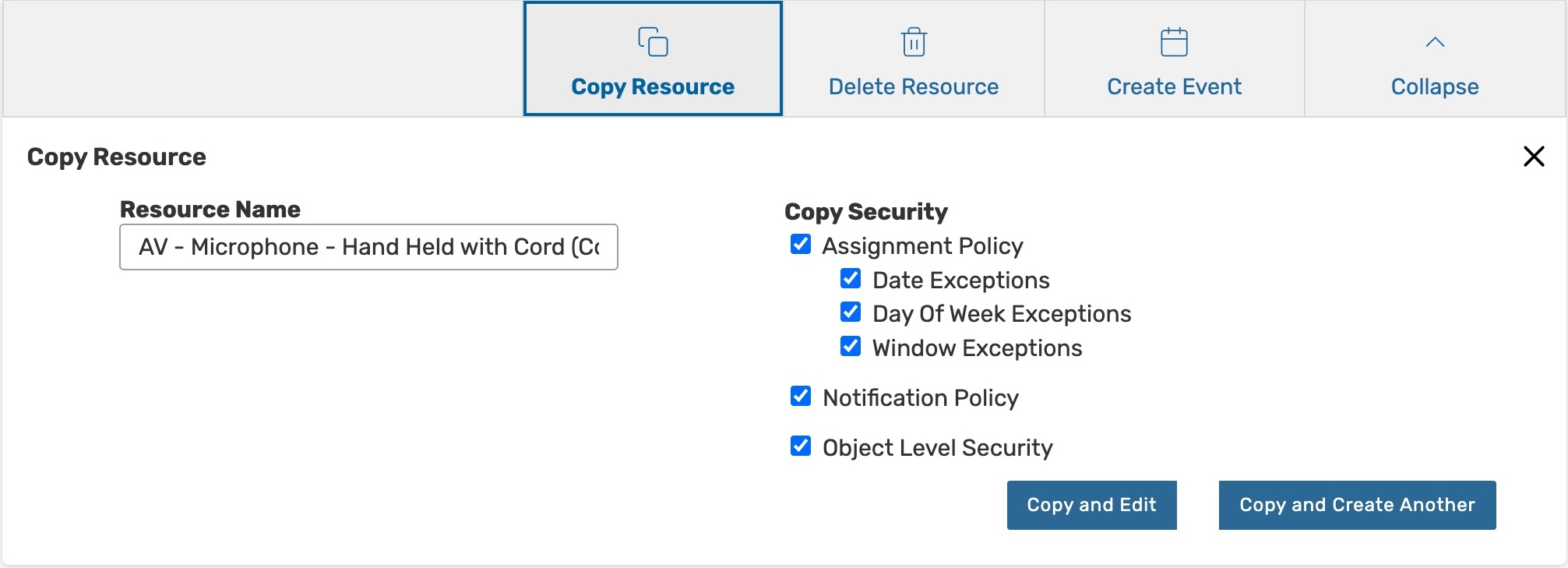 Image: Use the Copy Resource button to begin duplicating this resource.
Delete Resource
Permanently delete a resource by toggling Delete Mode to On and confirming. Warning: This action cannot be undone.
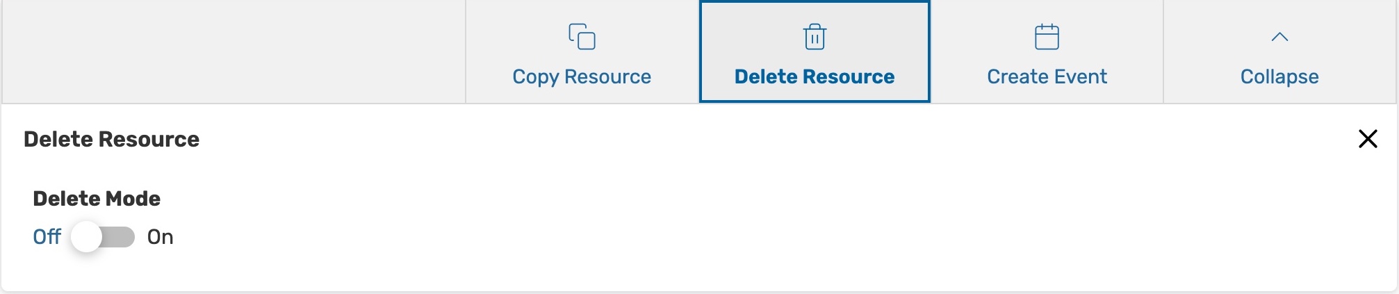 Image: Toggle Delete Mode to On to permanently delete a resource from 25Live.
Create Event
Opens a new event form with the resource that you are viewing already selected.
For more information, see, Creating Events With the Event Form.