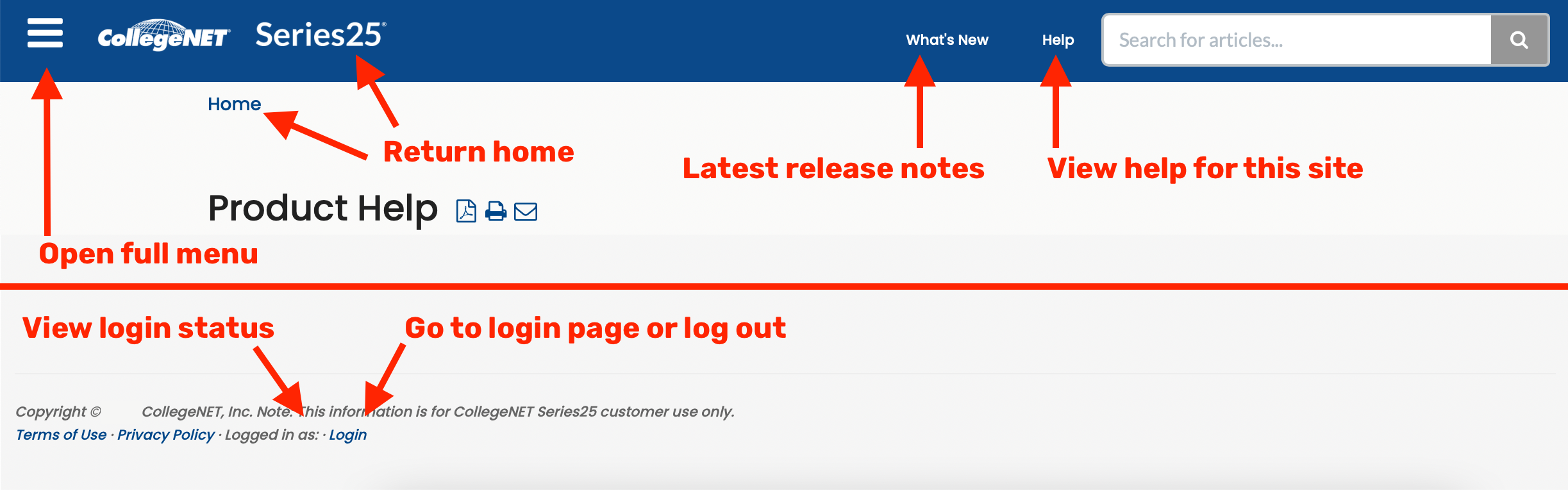
Click here to view related articles.
The Publish settings are an integral first step in styling your calendar so that it matches your campus's website styling. Before you take this step, you need to collect some information from your campus's webmaster so that the style settings in the calendar will match the style setting in the Cascading Stylesheet (CSS) used by the campus's website.
Tip: Collect Info Before You Begin
- What font stack is the campus using (e.g., 'Times New Roman', Times, serif OR Helvetica, Arial, sans-serif)?
- Does the primary font in the stack reference a served font like Adobe Typekit or Google Fonts?
- What is the base text color (in hexadecimal)?
- What is the background color (in hexadecimal)?
- What is the base font size (in pixels)?
- What is the background color for today's date on the calendar (in hexadecimal)?
- What is the base border color for borders in your website (in hexadecimal)?
- What is the default color of links (in hexadecimal)?
- Does the link change color when you hover over it? If so, what is the hover link color (in hexadecimal)?
- Using relative measures (rem), what is the line height for spacing between lines of text (e.g. 1.5rem)?
- Do you use a serif font for headers on your web page? If so, what is that font stack?
- How do you want to format dates (e.g. March 31, 2020, 3/3/2020, 03/03/2020, Mar 31, 2020, etc.)?
- How do you want the day of the week to be formatted (e.g., Tues, Tues., Tuesday)?
What does rem mean?
CSS3 introduced a few new units, including the rem unit. Rem stands for "root em". The em unit is relative to the font-size of the parent which can cause problems with font sizing in your calendar. The rem unit is relative to the root element, normally an html element. You should use rem units for font size instead of the default, pt, that is specified by the default calendar build.
Publishing Settings
Having all of this information with you when you click the Publish button will allow you to quickly set up the global settings for your Publisher calendar.
To begin the process of publishing your calendar in 25Live Publisher, take the following set of steps:
- Login to 25Live Publisher.
- Locate the calendar for which you want to work and click it to make it the Current Publication. The active calendar will have a check mark and be in bolded text. You may notice a blue arrow pointing down beside each calendar. That is a short-cut menu that allows you to: Edit Colors, Go to the published view, Create a sub-calendar, Delete a calendar, Share a calendar, Publish a calendar, Email a calendar, and control Calendar settings.
- Click either the Publish calendar command in the short-cut menu for the calendar or click the Publish button from the menu above the calendar in 25Live Publisher. This will open the Publish settings in 25Live Publisher.
- Configure your Publish Settings
Configurations (Click to Expand)
Publish Settings
Default Calendar View
This is set to Classic Table by default for each newly published calendar.
There is no way to preview the default calendar views in the Publish settings. Although you may change the Default Calendar View, it is better accomplished on the Calendar spuds tab where you can preview every calendar view and remove the Classic Table view if you would rather not use it.
Publish Settings
Calendar Name: If you want to change the Calendar name chosen when you published the feed, you may do so here.
Unique Web Name: A unique identifier of this calendar that will default to the name of the calendar. Best practice: Add the name of your 25Live instance in front of the calendar name.
Check availability: Click here to ensure your web name remains unique.
Calendar Address: Enter the full link (URL) to the web page which will host the calendar. Do not enter this address here until you have completed styling the calendar as you will want to preview your work in 25Live Publisher prior to posting it on your campus website.
Description: A description of the contents of the calendar.
Access Type: Indicates whether this is a Public calendar, a Password protected calendar, or a calendar behind a Secure URL like a portal page. (Most of your calendars will likely be Public.)
Distance Unit of Measure: Choose the unit of distance that is best suited for your location.
Display Unpublished Fields: Fields that you have made invisible to the Details view of a calendar entry. For instance, it is not uncommon for institutions to hide the Event State from the details view. Those hidden fields will turn up over time in this drop-down list where you can selectively add them to future calendars.
Featured Event Field: The name of the event custom attribute created in both 25Live System Settings and 25Live Publisher. To see how to create the Featured Event field in 25Live Publisher, visit Featured Events in 25Live Pro and 25Live Publisher.
Enabling this functionality is key to featuring events on Promotional spuds as well as controlling for special formatting of calendar entries on the Classic Table, List, and Tile calendar views.
Enable Filter Views: Best practice is to enable filter views, as they allow you to define predefined filtered views of your content for this calendar.
Enable Filter Cache: Enabling will speed up the performance of your filter but limit the range of data that may be used.
Mix-In Events From These Calendars
This group of settings contains a list of all the pre-existing calendars that have been created from Publisher feeds. To review the concept of mixed-in calendars, visit Building a Mixed-in Container Calendar in 25Live Publisher. Mixed-in calendars and top-level/sub-level calendars give us a way to create more comprehensive calendars from multiple calendar feeds.
To mix another calendar into this calendar, you simply place a checkmark in the box next to the additional calendars you want to add to this one.
Search
These settings govern whether or not the search engine spiders may scan your calendar entries for search engine listings.
Searchable: For public-facing calendars, select the Yes radio button to make them searchable.
Search Keywords: A set of meta tags that contain words and phrases that would help someone searching in Google, Yahoo, or Bing to find your events. Enter a comma-delimited list of keywords, and do not include a space following the comma.
This item is actually more important than you might think. The words and phrases you choose should be in the Event Title (or Event Name) and the Event Description fields on your events. When the search engine spiders comb through your calendar, the keywords corresponding to actual elements on the events will raise the relevance of those events and give them better search positioning.
City and Region: Increases the relevance of your events and puts them in context for people searching the web.
Display Options
These settings control the time elements of your calendar.
Time Zone: All calendars default to Pacific Time. Choose your time zone from the comprehensive drop-down list of options under Time zone.
Week Display Starts: The day of the week that each week will begin with on your calendars. Best practice is to keep the default setting of Sunday as Western countries' users are accustomed to the Gregorian Calendar framework that starts on Sunday.
Day Display Starts: Determines the hour with which you want the days to start in this calendar. Set the start time that is appropriate for your campus calendars.
Day Display Ends: Determines the hour with which you want the days to end in this calendar. These are set on the hour and should be set to a time that is appropriate for your events at your campus.
Email Settings
These settings control e-mail settings and functionality for this calendar.
Email Subscriptions: Turns on the ability for automatic e-mails to be generated for this calendar and allows viewers to add themselves to the distribution list. The distribution list for each new calendar starts out empty.
Forward Replies: Enabling this setting on will forward calendar and event e-mail replies to the calendar owner (the Publisher User) so you will want to ensure that the generic Publisher user is a real account that can receive e-mail responses.
5. Commit your settings by clicking the Publish button to begin settings the other settings controlled under the Publish Settings tab.
6. Once you click the Publish button, you are presented with all of the other options for styling a Publisher calendar. Initial publication creates the following tabs: Publish Settings, Calendar Spuds, Control Spuds, Promotion Spuds, Email, Feeds, and Hosted View.
7. To complete the initial styling, you will need to visit the pages linked by pressing the buttons on the Publish Settings tab including Edit Styles and Icons, Edit Calendar Colors, and Edit EA Settings.
If you need to change the Publish Settings later, select the Edit Publish Settings button.
Publish Settings - Edit Styles and Icons
The Edit Styles and Icons pages contain global settings controlling elements like fonts used by the calendar, font sizes, line heights, and more. These global settings will roll throughout your entire calendar saving you significant time in completing your styling work.
To begin the styling of your new calendar:
In the Publish Settings of the calendar, click the Edit Styles & Icons button to open the global styles.
The Global Settings window will open in which you will apply your global style settings. There are two tabs for which you need to review settings. The first is the Styles tab which controls a significant portion of stylistic settings for your calendars. The second is the Icons tab which allows you to choose between different icon sets for your calendar.
Configurations (Click to Expand)
Styles and Icons
Styles Tab
Font Scheme
The Font Scheme is used to supply the link to any custom fonts you may be using for text on your web page, most commonly either a Google Font or an Adobe Typekit font. If you are using a served font from one of these providers, you will see that the Custom font link has specific formatting that you have to follow in order to be able to use the font later in the Global Settings screen. You may use multiple custom font links by enclosing each in separate <link href> html tags. Doing so would allow you to use a custom sans-serif font for body text and a custom serif font for header text.
Formatting the Custom Font Link for Google Fonts and Adobe Typekit
If you are using a Google Font, the custom link should look like the following:
<link href='//fonts.googleapis.com/css?family=Open+Sans:400,500,700' rel='stylesheet' type='text/css'>
Notice that the http: has been removed, which is a useful approach if your font and your calendar may be used on either http or https pages.
If you are using an Adobe Typekit® font, the custom link should look like the following:
<link rel="stylesheet" href="https://use.typekit.net/xxxxxxx.css">
You must replace the xxxxxxx value with the value for your font.
Base Page Styles
The Base Page Styles allows you to start supplying that stylistic information mentioned earlier to your calendar.
Base Font: Control the base font stacks for the calendar. If you have indicated that you have a specific sans-serif font that you want to use as your Base font, you should enclose it in single quotes (e.g., 'Open Sans' helvetica, arial, sans-serif).
Best practice for your font stack is to match what is being used for body text on your campus website.
Base Email Font: Control the base email font stacks for the calendar. Best practice is to match this to the Base font stack so that e-mails carry your stylistic branding.
Base Background Color: TBest practice is to set the Base background color to white (hexadecimal #ffffff) or another light color.
Consider checking the contrast between your background and text colors when setting these values, as this will impact readability and accessibility.
What are em and rem in CSS?
Em and rem are relative length units specifying a length relative to another length property. These elements allow you to scale better between different rendering mediums (e.g., laptop vs. tablet vs. cellphone). The em is relative to the font size of the element (2em means 2 times the size of the current font). On the other hand, the rem is relative to the font size of the root element. The em may sometimes cause fonts to scale to the font-size set on the bounding element that contains your calendar. Since that is not what we want, we may use the rem to scale to the root font size of 16px.
Base Text Size: Text size across the Publisher environment uses points (pt) rather than pixels (px). 12pt/16px is generally accepted as an ideal font size for reading web content.
Base Line Height: Controls the line height (the spacing between lines of text on a website).
The value entered here is multiplied by the base font. Best practice is to set the base line height to 1.4rem so that the scaling of the line height will be controlled by the Base font size of 16px. Mathematically, the base line height evaluates to 22.4px.
Base Link Color & Base Hover Color: Control the coloration of links. Best practice is to add the hexadecimal color for the link when you load the page and the hexadecimal color (a color change) that happens when a visitor hovers over the link.
Your buttons will typically behave like your links and on many websites, the Base Button Background colors will be the same as the Base Link Color and the Base Hover Color. However, if your website uses a different color scheme for buttons you may set that in these settings.
The text color for the text label on your buttons will need to take into consideration the background color of the buttons. Dark button backgrounds usually use a white or a brighter color while lighter button backgrounds would use darker text colors.
You also have control over how the links behave on the calendar. Are links on your website underlined when you load the page? If so, you would set the Base link text decoration to underline to ensure that the links are underlined by default. The Base hover text decoration controls whether or not the link gains an underline when hovered over by a visitor to the calendar. Very often, link settings are set to None for the Base link text decoration and Underline for the Base hover text decoration.
Base Border Color: Used for the borders of objects on your web page and or your calendar.
Base Today Background Color: Used on the calendar to denote the current date. Typically speaking, lighter pastel colors work better for base today background colors.
Base Border Rounded Corners: Controls how corners of buttons and other objects on the calendar are formed. Setting this to 0px will return perfectly square buttons and square boxes as in pop-up boxes. Adding a radius value in pixels will round the corners of these boxes. A radius of 4px produces slightly rounded buttons and boxes on your calendar.
Global Settings
These settings control how headers, groups, and subgroups are formatted. These settings might be a location where you would apply a serif font different from the global content text set earlier to a sans-serif font.
Global Header
These settings control how header text is formatted throughout your calendar. For consistency with your campus website, consider making choices based on how fonts have been formatted there and throughout the rest of your Publisher configurations.
Global Header Font: Set in points (pts). To make the fonts more responsive to different sizes of screens, you should consider converting this to a relative length measure. A simple calculation will allow your headers to be relative to the size of the new setting in pixels. So, if the global text size is 10pt, you'll need to divide 12pt by the 10pt size and you return a value of 1.2. That would mean your input for this column would be 1.2rem.
Global Header Color: Set to a hexadecimal color code. Best practice is to match this to your campus stylesheet.
Global Header Text Transform: Allows you to convert the text in the header to one of the following formats: none, capitalize, uppercase, and lowercase.
Calendar View Groups
Repeat the steps above for the Calendar View Groups which controls the grouping headers on your calendar. You will likely want to set the Global group background color to the same Base background color you set earlier on this screen. The calculation of the Global subgroup text size would be 9 divided by 10 to arrive at a rem value of 0.9rem.
Featured Events
The final group of settings on the Styles tab concern how Featured Events are treated. You may have different settings for how your featured events text, links, and background color are formatted to make these events stand out more prominently. It is customary for the Global featured text color, Global featured title link color, and Global featured details link color to be formatted to match the Base text color, Base link color, and Base hover color, respectively. You might consider using a light shade of color behind your featured events to make them stand out on the calendar.
Icons Tab
Next you may review the Icons tab to see what icon sets are available for use with your calendar. Use your own set of icons by uploading a New icon image and then searching for it with the Magnifying Glass. The majority of campuses simply make use of the Default icons set as uploading your own means you have to create an icon for each of the icon images listed and they must be sized to match the size of those you are replacing. CollegeNET does not suggest use of the Classic icons set nor the No icons setting.
Once you have completed all your work on the Styles and Icons tab, you may preview how your settings have affected the calendar by clicking the Preview button. Once you are happy with all of your settings, click the OK button to save your changes.
Publish Settings - Edit Calendar Colors
Used these settings to add a color shading underneath the events for multiple calendar feeds mixed together as part of a mixed-in calendar.
To edit these settings, click the Edit Calendar Colors button under the Publish Settings tab.
Configurations (Click to Expand)
Publish Settings
Default Calendar View
To edit the Calendar Colors, you will need to select the Yes radio button listed under the Use calendar colors option.
Edit Your Calendar Colors
Background and Text: Apply to the entries on this calendar.
Consider checking the contrast between your background and text colors when setting these values, as this will impact readability and accessibility.
Link and Hover Link: Best practice for these two settings is to match them your base text and link colors set in the Global Settings earlier.
Once you are finished working with the Calendar Colors, click the OK button to save your changes.
Publish Settings - Edit EA Settings
The last set of Publish Settings that you will need to set up are the EA Settings. EA is an abbreviation for Event Actions. This area is the first of two areas where you will manipulate event actions on your calendars.
To edit the EA Settings for your new or an existing calendar navigate to the Publish Settings tab for your calendar, locate and click the Edit EA Settings button to open the EA Settings for review.
Configurations (Click to Expand)
EA Settings
Field Options
These settings control the fields that will show up on the details of your events and how they will behave.
Display Calendar Name: Controls whether the name of the calendar is displayed with each event when you are reviewing it.
Description Character Limit: Allows you to set a maximum number of characters to show for the Event Description. As the note indicates, a blank value means no limit.
Custom Field Character Limit: Allows you to set a maximum number of characters to show for custom fields and again a blank value means no limit. As the custom attributes that this field would control often contain far fewer than 200 characters, this field usually gets set to blank when most campuses are building their calendars.
Location Label: Use this field to set the location label.
Description Label: Use this field to set the description label.
Link Label: Use this field to set the link label.
Image Settings
The Image Settings are used to control the Event Image or Detail Image of the event. There is more granular control of this in the spud tabs that follow but this setting controls what appears when a user takes an event action.
Max Image Width (pixels): Ensures that images with a larger width are reduced to this 100px width.
Max Image Height (pixels): Ensures that images with a larger height are reduced to this 100px height.
Show Inline Images: Allows you to display images included in the Event Description using HTML's <img> tag. For these images to display properly, you will need to provide the entire URL as a relative URL would return a broken image link.
Registration Messaging
You may ignore the Registration Messaging settings as the Registration module is not functional for Publisher.
Dealing with Images in 25Live Publisher
The 100px X 100px height and width setting creates essentially a square box, but what if your image is rectangular with a bigger width but less height? When an image that is rectangular exceeds the sizing provided for by the max width setting, the image will reduce to fit that width and create a distortion of the image contents. You can get around this problem by controlling just one of the elements concerning images. For instance, many calendars will set the Max image width to 75px or larger and then leave the Max image height blank. That allows the height to be variable and removes the risk of distortion when the image reduces to fit the boundaries of the image object.
When you have completed your work setting EA Actions up for your calendar, click the OK button.
After completing your work with Publish Settings, you will want to begin working with the Calendar Views.